
SouthState Banking App — Budget & Save + Alerts
A concept redesign focused on helping users manage budgets, categorize spending, and quickly view account activity and alerts.
Role: UX/UI Designer
(end-to-end)
Deliverables: User flows, wireframes, UI screens, icon direction, layout system
Tools: Figma (add others if used)
Timeline: (add your real timeline)
Outcome: High-fidelity prototype + core flows for budgeting and account alerts (add usability/testing outcomes if you have them)
My Role
I led the design from early concept to high-fidelity UI. My focus was clarity, accessibility, and reducing cognitive load in high-frequency banking tasks.
What I Did
Defined the key flows (budgeting + account/alerts)
Created quick wireframes to iterate on layout and hierarchy
Designed a clean UI direction and supporting icon set
Built a consistent layout system for spacing and alignment
The Brief
Our goal was to design a user-friendly, visually appealing mobile app that not only met the practical needs of users but also reflected SouthState Bank's commitment to community connections.
Make budgeting and savings planning easy to start and maintain
Help users find key account info and recent activity instantly
Reduce friction in common actions with simple, predictable navigation
Keep accessibility in mind across the UI
Goal
User Flow
This concept focuses on users who want a quick view of their money and guidance to build healthier habits.
Primary Use Cases
Check balance and recent transactions
View latest alerts without digging
Create/adjust a budget
Categorize spending and track progress toward goals
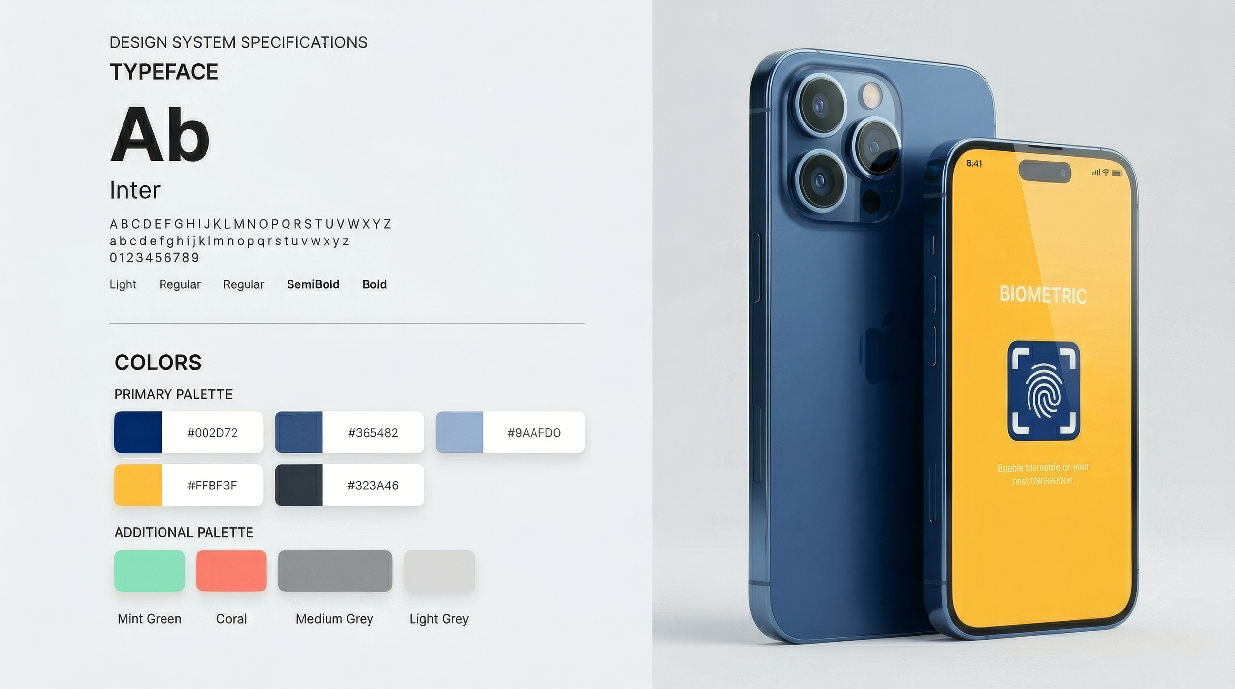
Icons Direction
Icons support recognition and speed—especially for alerts and categories—by reinforcing meaning at a glance and improving scanability in dense financial screens.
Key Flows
This concept focuses on users who want a quick view of their money and guidance to build healthier habits.
Flow 1: Budget setup / review
Entry point: Budget & Save
Core actions: create categories → set targets → track progress
Flow 2: Account overview + alerts
Entry point: Budget & Save
Core actions: create categories → set targets → track progress

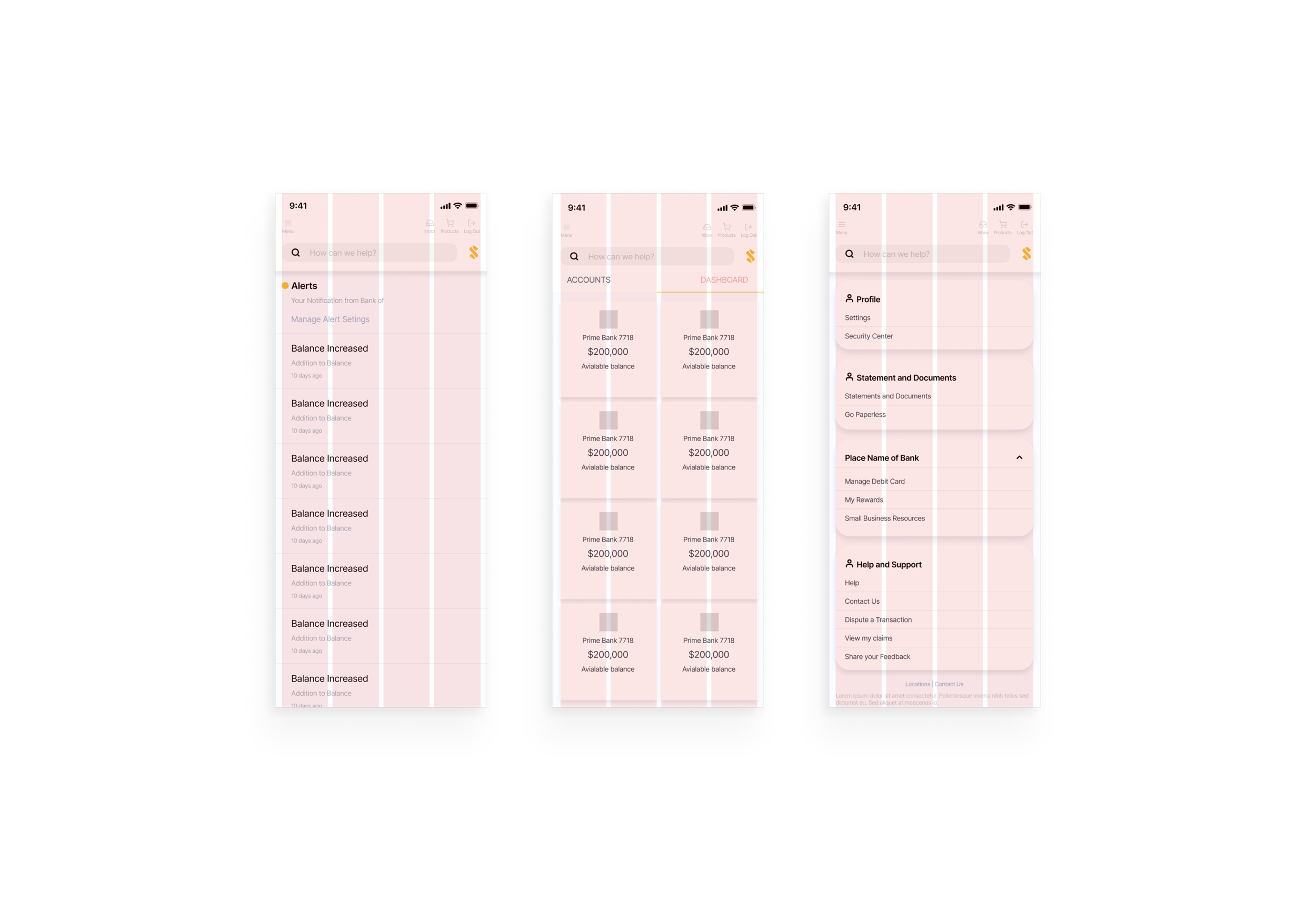
Wireframes & Early Layout Decisions
Wireframes helped validate hierarchy and navigation before UI styling. I focused on:
Clear information priority (alerts vs. transactions vs. balances)
Consistent placement of primary actions
Simple patterns users already understand in finance apps

Mobile app UI
UI — Budget & Save
A budgeting space designed to help users categorize spending, set targets, and track progress over time—supporting better day-to-day decisions without overwhelming detail.

Mobile app UI
Bank Account & Latest Alerts
Users can select an account and immediately view recent transactions, with alerts surfaced so important updates don’t get buried.

Layout System
I used a simple modular layout approach to maintain consistency across screens, improve readability, and keep spacing predictable—especially important in information-dense financial UI.
Outcomes
Delivered a cohesive UI direction for budgeting and account/alerts experiences
Established consistent hierarchy and spacing for readability
Created a foundation that can expand into additional banking features (payments, transfers, goals)
Next steps
Run usability tests on key tasks (create budget, find alert, locate a transaction)
Validate information hierarchy with real users and iterate based on task success
Expand the component set (buttons, list rows, alerts, cards) for scalability